

Younger buyers expect a bold, modern store, but jewellery still needs to feel precious. The site had to do both.
We built a dark, high contrast design with an oversized wordmark, cinematic product shots and a clean shopping experience.
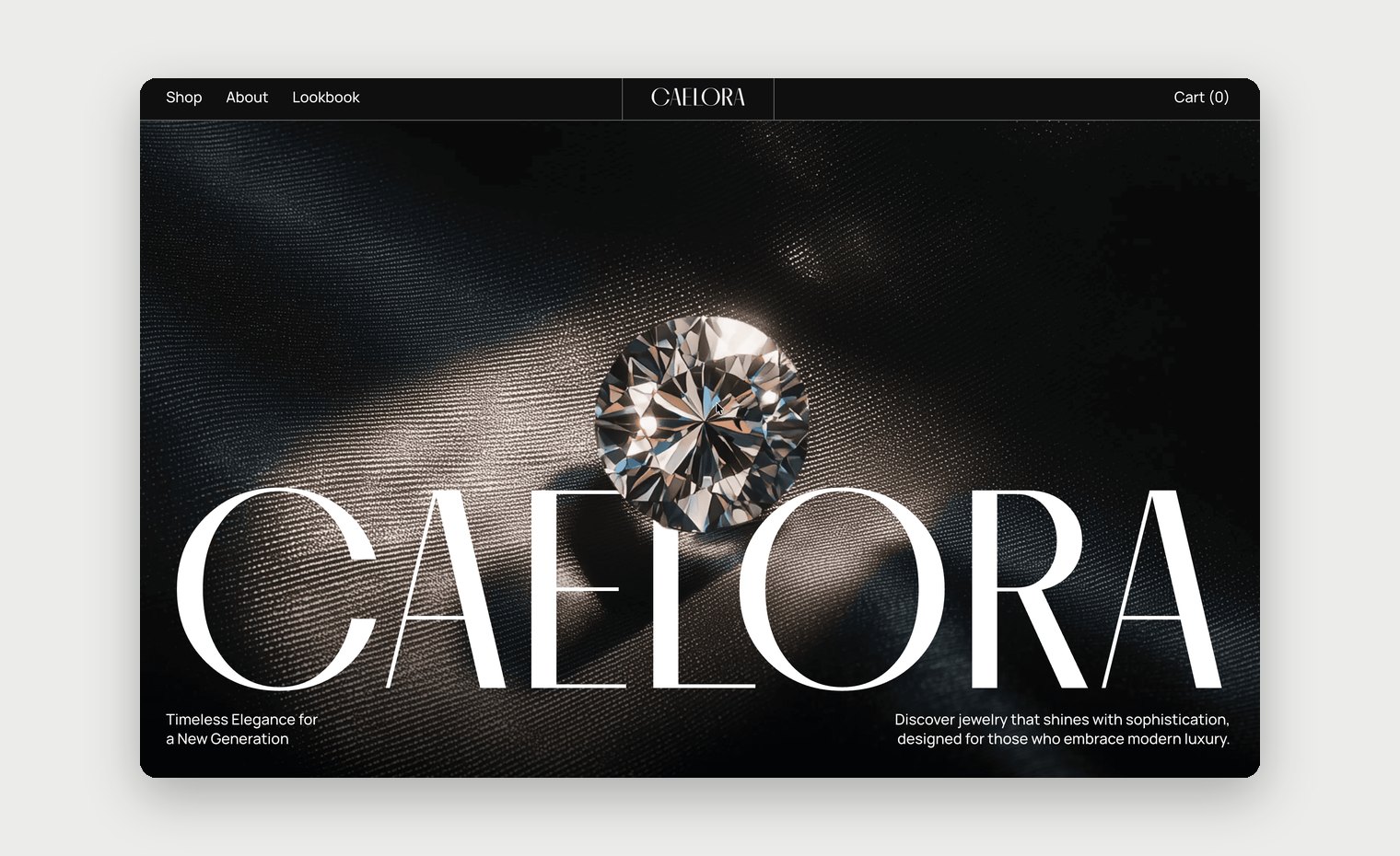
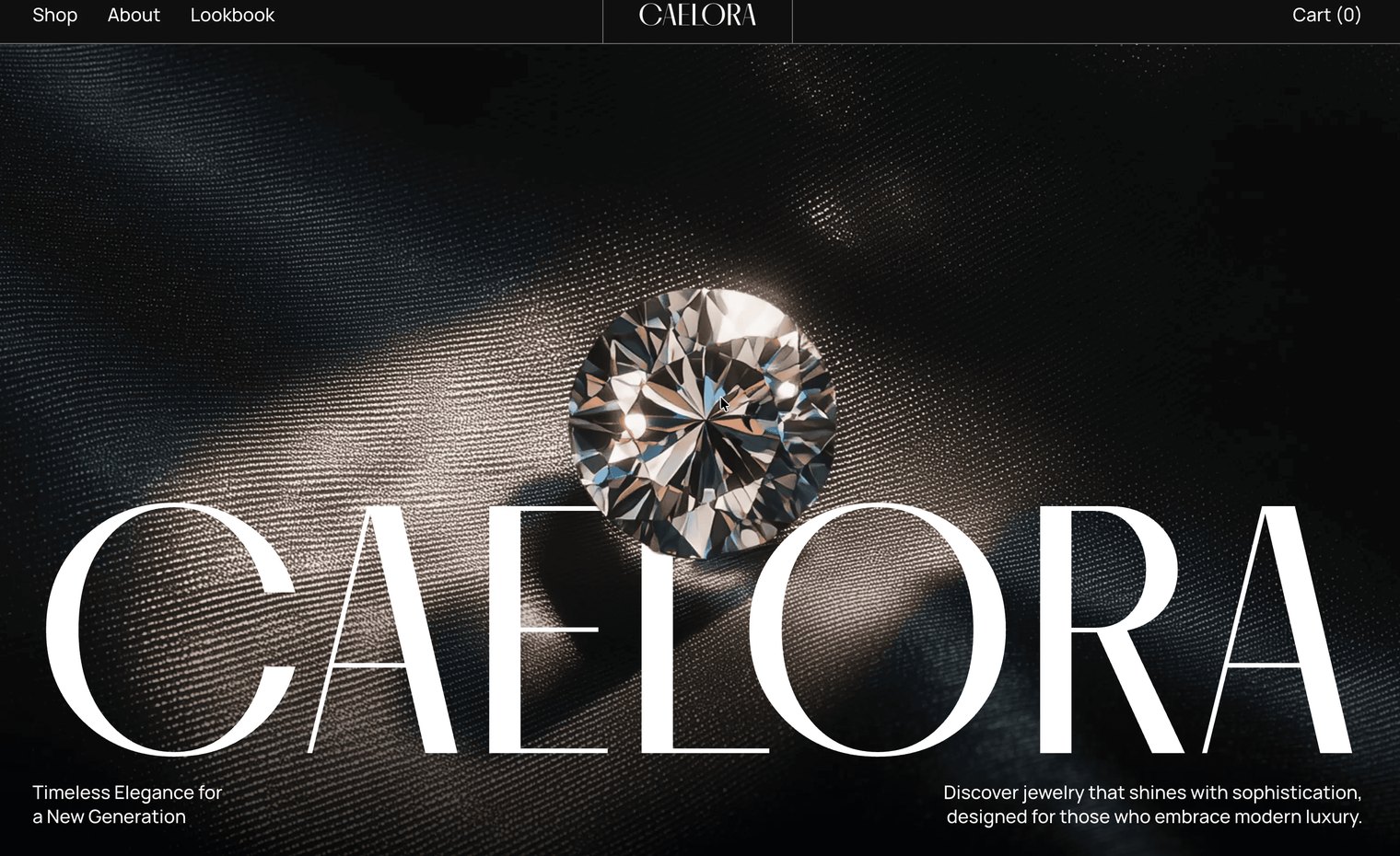
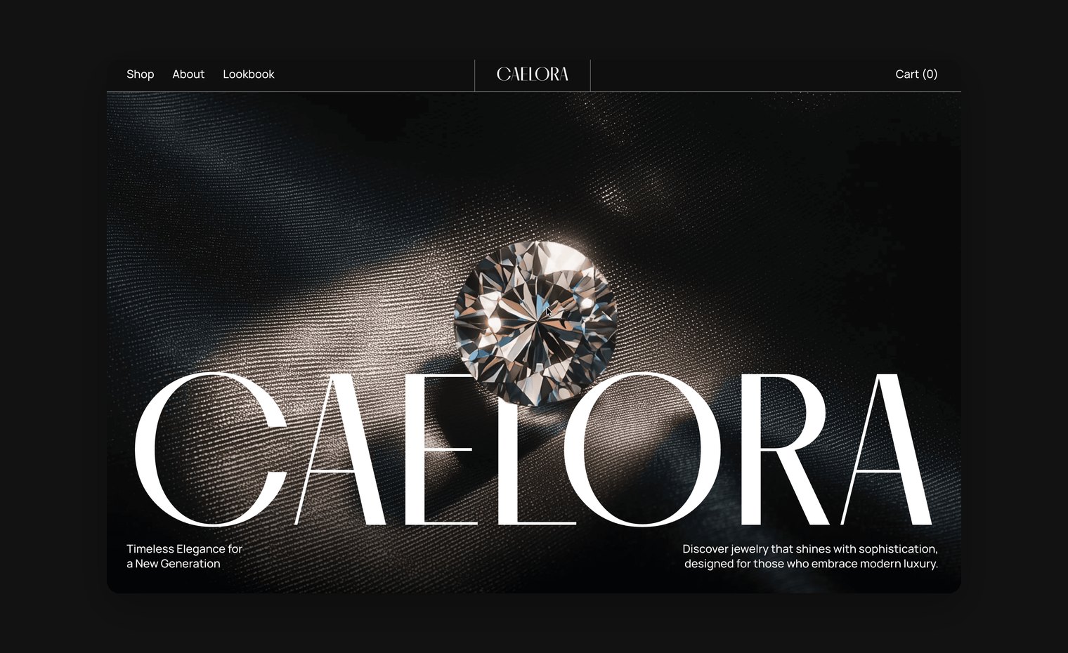
The result is a store with real presence that still keeps the focus on the pieces.
For us, Caelora was a chance to push the visual side and make a store that stops people scrolling.
Next projects.
(2026©)